
Foundation
Everything a small brand needs for a sharp first impression
- Structured blocks instead of a chaotic page builder
- Multilingual routing, SEO, and editorial flow from day one
- A frontend that feels like a product, not a generic theme
- Shared-hosting-friendly architecture with file-based storage
Editorial
A website should feel calm, clear, and self-assured
miniCMS is built for presentation websites where content, visual hierarchy, and publishing speed need to work together. Instead of a messy builder, you get structured blocks, clean translations, and a frontend that is ready for serious launch stories.
Editorial system
Blocks give the team rhythm, not constraints
Every block has one job: explain, prove, deepen, or convert. That means less improvisation, fewer layout breaks, and a much steadier editing experience across the whole page.
The team can quickly reorder sections, add new ones, or replace imagery without collapsing the structure.
Roadmap
Placeholder content is now spread across all key block types
This is not final brand copy yet, but it is strong enough for a full UX pass: spacing, section rhythm, gallery behavior, CTA flow, and mobile navigation can all be judged properly now.
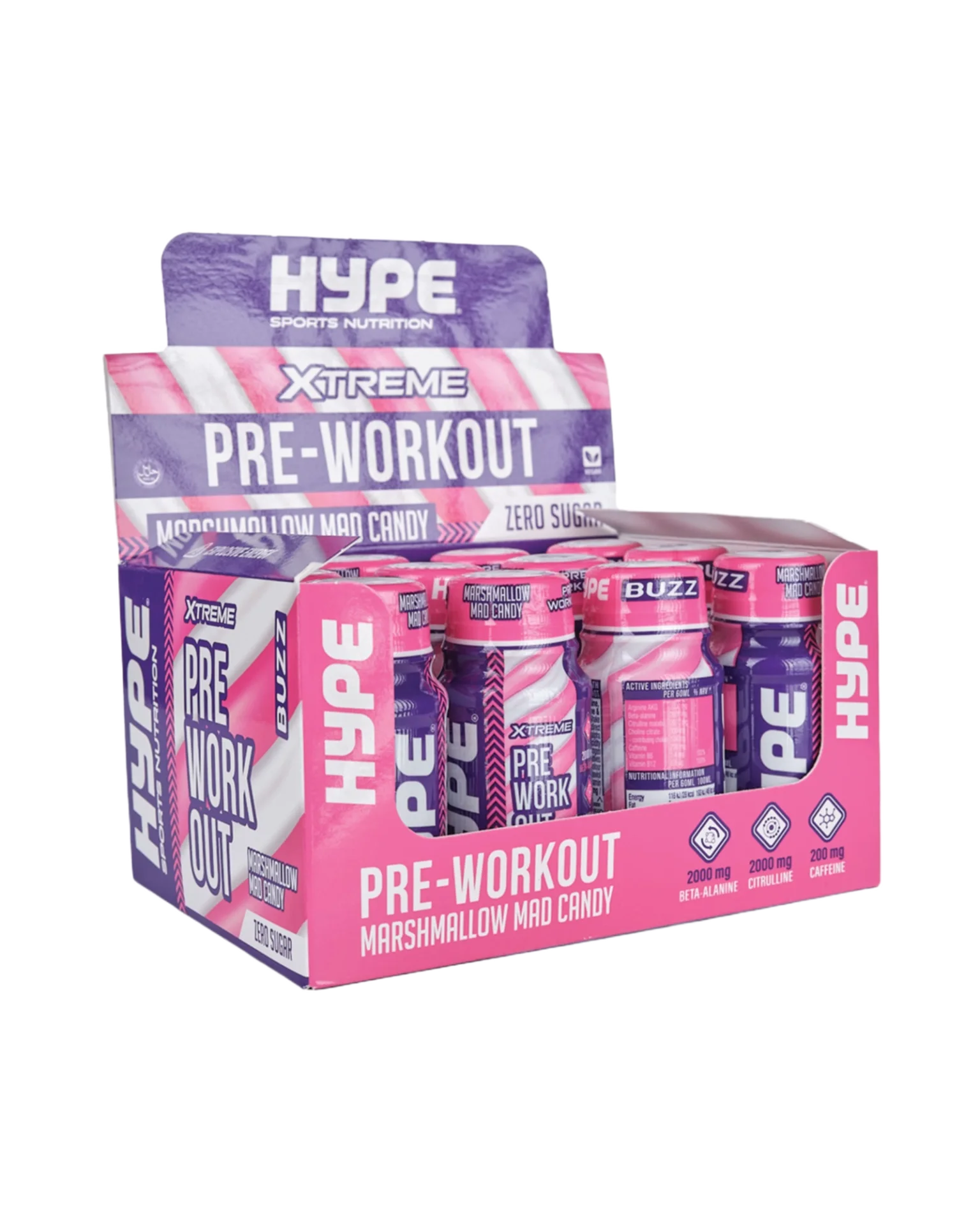
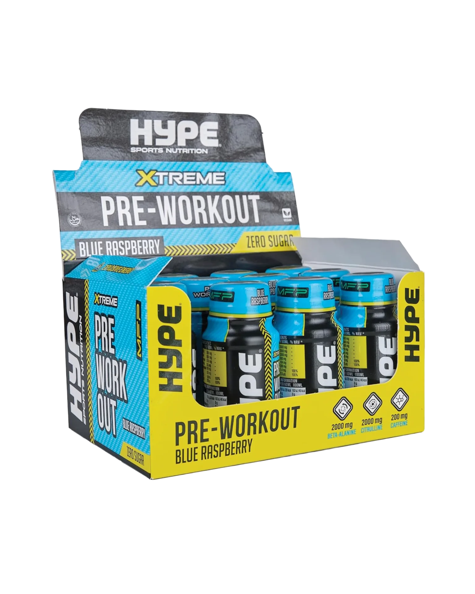
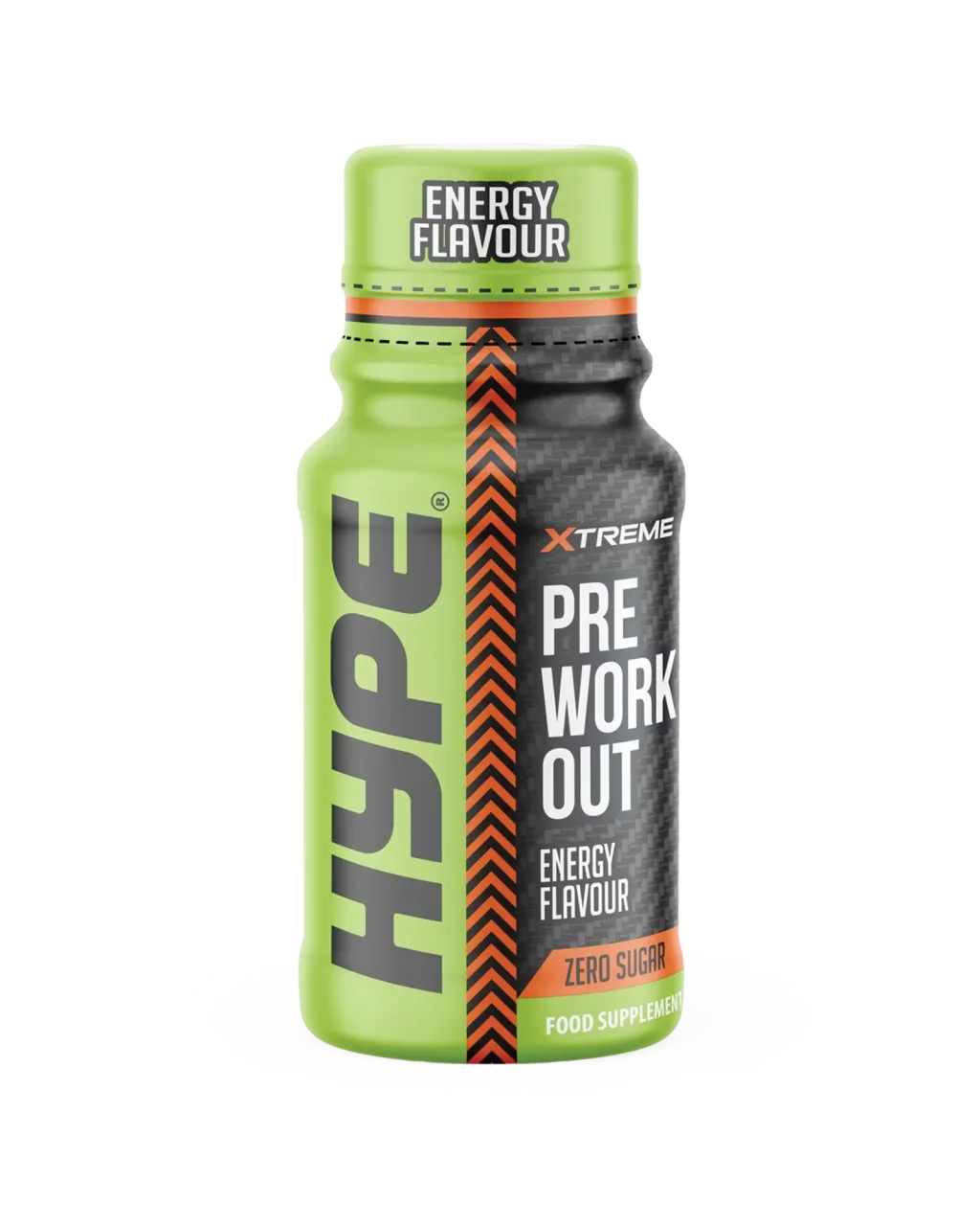
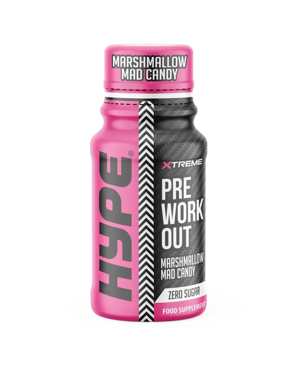
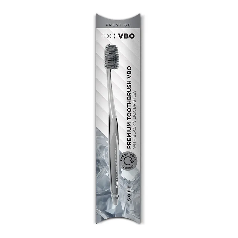
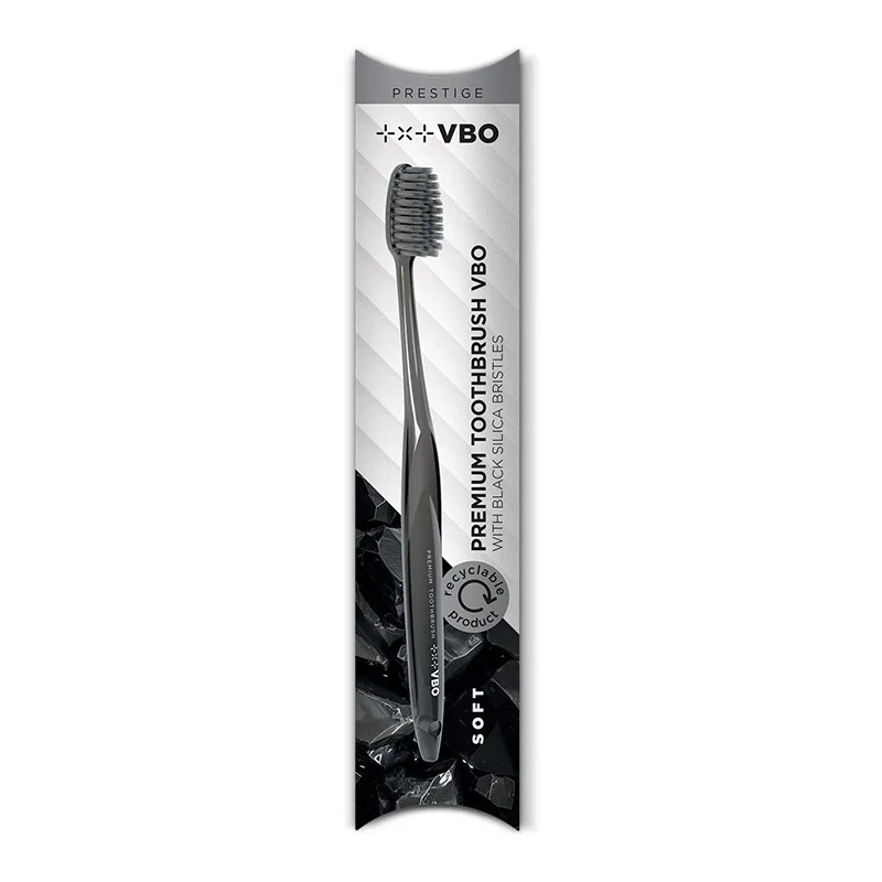
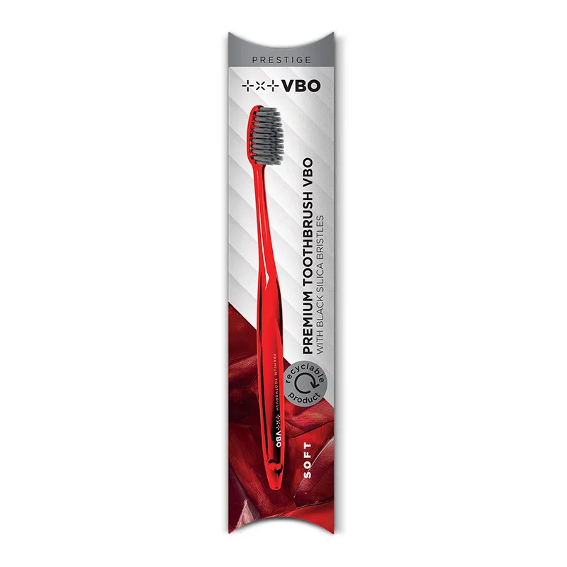
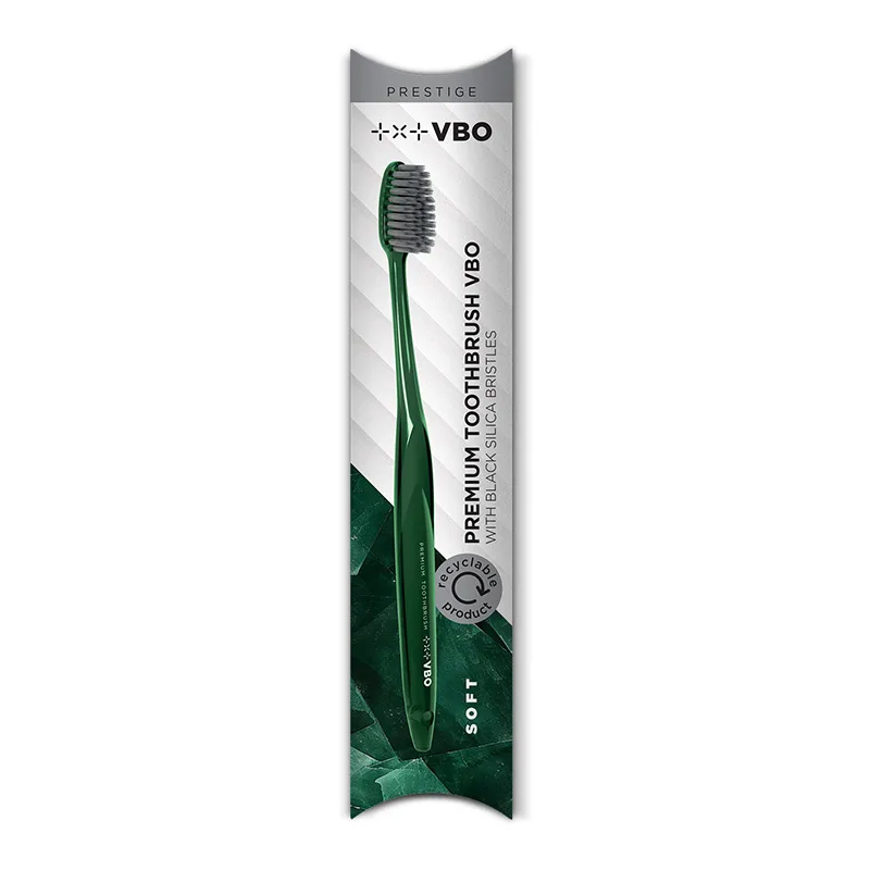
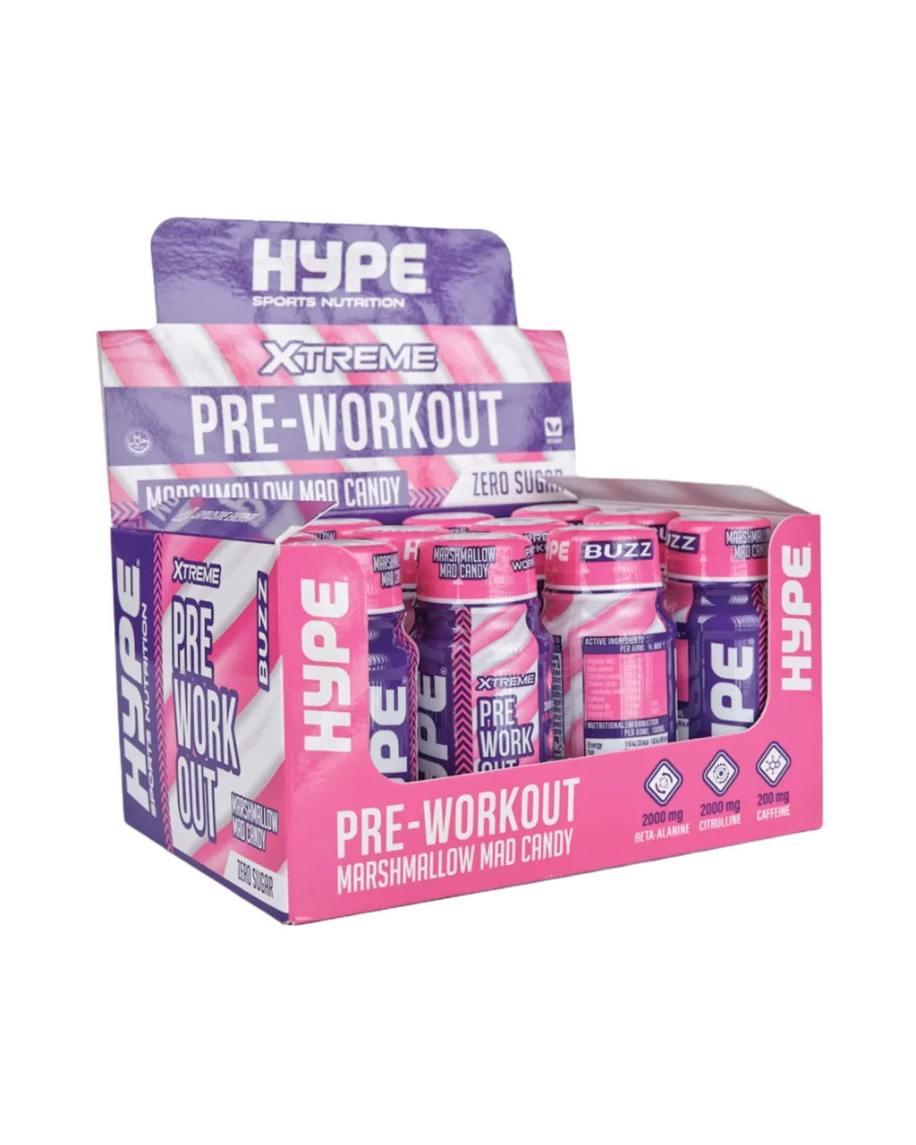
Showcase
The gallery now behaves like a real product catalog
The gallery block supports sorting, lightbox viewing, and multiple visual rhythms, so it can serve as a catalog, reference wall, or editorial product sequence.
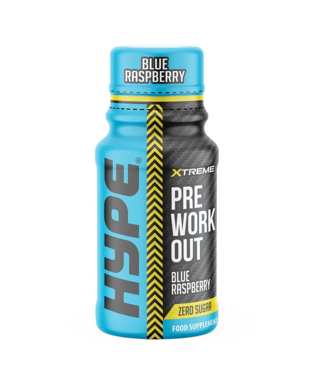
A clean packshot frame for a premium catalog or hero support section.
A stronger color accent for promotional or seasonal campaigns.
A neutral version suited to cleaner lifestyle or wellness stories.
The most energetic frame for CTA-led or teaser sections.
A strong finishing contrast for gallery rhythm and mobile scanning.
Trusted by
Placeholder logos to verify the partner-section rhythm
The logos are demonstrational for now and mainly help validate contrast, spacing, and responsiveness. Final brands can be swapped in later without changing the structure.
HTML
The rich text block stays useful, not chaotic
When you need a little more editorial freedom, the rich text block is there. It still stays inside the system, so the page does not turn into an unruly document.
- good for short manifesto-style sections
- useful for highlighted lists or editorial intros
- safe for multilingual content and fast iteration
FAQ
The most common questions before a first launch
Yes. The core is intentionally light, with no database dependency and no heavy infrastructure.
Yes, the blocks are structured and re-orderable, so day-to-day editing stays fast and safe.
Yes. The language model is ready to grow without breaking the existing pages.
Social proof
How the reference section should feel
“The site already felt premium in the first iteration.”
Nina Kranjc Creative lead“The biggest change was that editing finally became clear.”
Tomaz Hribar Founder“The mobile view was not an afterthought, it was part of the system from the start.”
Maja Belec MarketingA small CMS should create a sense of order. Once that is in place, the frontend immediately starts to feel more premium.
Team
A placeholder team to validate portrait layout and copy rhythm
Nika Zupan
Strategy and content
Keeps the page structure, tone, and editorial pace aligned across sections.
Jan Kovac
Product design
Shapes the visual hierarchy, CTA flow, and the overall sense of premium restraint.
Eva Mlakar
Operations and launch
Connects production, translations, and the final live QA before release.
Motion preview
The video block adds pace without breaking the page
It works well for a product teaser, a short service introduction, or a process explainer. The section stays light, responsive, and visually aligned with the rest of the page.
Channels
Quick links for contact and content distribution
Single frame
Even one image can carry an entire section
The image block is ideal as a visual break between denser content zones. It adds pace, breathing room, and a place for a more precise emphasis.
Location
Where this brand might show up in person
The map block is a strong closer for a showroom, studio, office, or event location. On mobile it should remain light and readable, without feeling like a random iframe bolted onto the page.
Ready to launch
Once the foundation is right, the final polish gets much faster
This pass fills the block system, tightens the visual language, and prepares the frontend for real brand content. The next step is swapping placeholder copy and visuals for actual launch material.
Contact
Send a rough brief and we can move the next iteration in the right direction
Add the page goal, the rough scope, and the desired timeline. Even a lightweight brief is enough to validate the form flow, spacing, and the UX close of the page.